Dyslexia Font and Style Guide

Quick Facts about Dyslexia Font and Styles:
- There are several fonts that have been designed for the dyslexic reader including Dyslexie, Opendyslexic, Gill Dyslexic, Read Regular, Lexia Readable, and Sylexiad
- Contrary to media hype, and even a Scientific American article about Dyslexie, no independent research has found that any font significantly improves reading speed or comprehension for dyslexics
- A 2013 Spanish study found that Helvetica, Courier, Arial and Verdana were the best fonts for dyslexics, the same fonts of choice for many efficient readers
- Lightly colored paper, 12-14 point sans serif font, and bolding of text for highlighting are commonly believed to be best for dyslexics
- Glossy and bright white backgrounds, italics, ALL CAPS, and underlining have been found to impair reading for dyslexics
- Dyslexics are always in style
Fonts Designed for Dyslexics
Below is a look at some of the major fonts developed for dyslexics, why they were developed, how they are supposed to work, and what the research (if any) has shown about them thus far.
Dyslexie
|
Background Created by the Dutch, dyslexic, graphic designer Christian Boer in 2008 after difficulty studying for a final exam while at university. He aimed to create a font that would stop the letters from looking like they were spinning or moving. Learn more at the Dyslexie Font website. |
 The Dyslexie Font |
Vocabulary
The terms Font and Typeface are often used interchangeably, but in fact they have different meanings...
Font: The delivery mechanism for printing. The medium
Typeface: Refers to the artistic design of the letters, numbers and symbols. The media.
One sentence captures the distinction...."I like the typeface of that dyslexia font."
Unique Font Characteristics:
- Heavier line thickness at the bottom of
most characters intended to better anchor letters
- Slight downward slant on the curvature of the letters. Letters such as 'c' or 'e' may gape slightly more, or slump slightly in one direction
- Elongates or
diminishes the stem on some letters such as 'h and 'n'
- Thickens
or bolds capital letters and punctuations, to better identify where sentences start or end
- Adds space between letters and words
Research Findings:
A masters thesis by Renske de Leeuw of the University of
Twente found
Dyslexie had no effect on reading speed but found an overall reduction
in reading errors. Dyslexie was compared only against Arial and the sample size for the study was just 43, including 21 dyslexic readers. Though often cited by the design studio, the study is essentially neutral on the font's benefit. Perhaps they think people don't actually read it.
Open Dyslexic
Background
OpenDyslexic was created by American Abelardo Gonzalez and released as a free and open source font in 2011. He said he was motivated by the fact that other similar fonts (read: Dyslexie) were unaffordable.
Similarities with the Dyslexie font resulted in some nasty emails from Dyslexie creator Christian Boer, but the font remains free and open source.

The OpenDyslexic Font is Definitely Similar to Dyslexie
Unique Font Characteristics
- Letters have heavy weighted bottoms to indicate direction and help reinforce the line of text
- The unique shapes of each letter can help prevent the perception of letters reversing or swapping places
- Wider letter spacing than many fonts
- Unique italic styling
Research Findings
The
OpenDyslexia website itself ernestly notes that there have been no
formal studies conducted on OpenDyslexic while pointing out that there
exist studies on font features that have been incorporated into the font
such as extra space between letters.
Other Dyslexia Fonts, in Brief
Gill Dyslexic
This dyslexia font was created by the designer of Dyslexie, Christian Boer. It's not clear why he created a second font, though the cost is apparently less, so it may have been to compete with the cheaper Open Dyslexic, but it aims to reduce the symmetry between letters, making them easier to distinguish.
Like Dyslexie, the base of each letter is heavier than most other
fonts, helping to orient the letter correctly. A sample sentence is below.

Gill Dyslexic Sample
|
Read Regular Created by Natascha Frensch at the Royal College of Art in London, this dyslexia font avoids symmetrical mirroring much like Gill Dyslexic. It is not open source yet and apparently not for sale. At least one publisher is using it, but it's unclear how to go about getting the font. There is an e-mail address at her website if you want more information. |
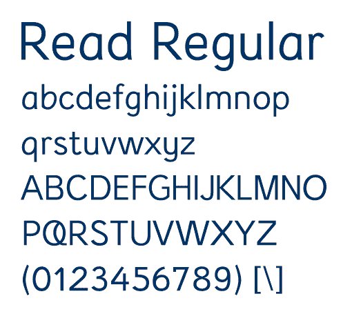 Read Regular is a Clean, Arial Like Font |
Each character is designed to stand on its own and work together with its previous or next character. Ascenders (bdfhkl) and descenders (gjpqy) are longer than most fonts to ensure distinction. Spacing within the o, e, a and u is enhanced and the openings in e and g are kept from visually closing in.
I was unable to find any reference to research conducted on the font.
Lexia Readable
Designed by Keith Bates at K-Type and available for purchase at their website, Lexia Readable was designed as a more mature Comic Sans font, suitable for older readers (i.e. not just comic books). It was designed to be more legible at font sizes as small as 8 points.

The Lexia Readable Typeface is Airy and Open
The Regular and Bold weights are free for use without a license by individuals, educational and charitable organizations. For pay, licensed packages are also available
Long ascenders and descenders combine with generous letter spacing and asymmetrical lowercase b and d to help distinguish letters - features seen in Dyslexie and OpenDyslexic. No research was found to have been conducted on the font.
Sylexiad
Sylexiad is actually a collection of fonts designed by Dr. Robert Hillier, a Senior Lecturer at Norwich University College of Arts and sold at his website where he describes it as an 'ongoing design investigation'.
His PhD dissertation was conducted on the font, though focused mainly on reader preferences rather than reading speed or accuracy. Among his conclusions was that:
" for the majority of dyslexic readers tested it was the combination of
handwritten style, uppercase forms, long ascenders and descenders, light
weight, uniform strokes, perpendicular design and generous inter-word
spacing that was preferred."

Sylexiad Sans Serif Font is Lighter Weight than Some Other Dyslexia Font
Why Dyslexia Font Failure is Actually Good News
The failure of new fonts to make a
significant difference vindicates a whole body of research that found dyslexia to be an
auditory and cognitive processing impairment, not a visual one.
It's largely a myth that dyslexics see letters reversed, flipped or moving. Only a minority have such a problem. Therefore we should not expect a dyslexia font to have much of an impact.
Remember that decoding letters and words into meaning is a cognitive process that takes place in your brain, not your eyes! The input matters, but processing trumps all.
Final Font Thought: Don't Fret
My own education in researching dyslexia font has lead me to the conclusion that fonts really don't matter much, so long as they are clean (sans serif) and have generous spacing between letters and words, but this is as true for dyslexics as efficient readers.
But by all means experiment with different fonts. Some people have been literally brought to tears by the freedom a new font provided but these are anecdotal accounts and probably exceptional circumstances.
There is no hard research
demonstrating improved reading speed or comprehension for dyslexics from any font.
A lot of good intent and effort went into the creation of the fonts and the media has given them a lot of gab but something has been missing from the whole discussion: Science.
The cutting edge of dyslexia research is converging on the fact that dyslexia results from inefficient processing of words in the brain— the way that letters and words are manipulated, stored and retrieved.
How could a font result in new global patterns of neural processing? If you understand this limitation, fonts are almost a non-starter.
Much of the rational behind the fonts is actually based on myths about dyslexia—that dyslexia is a visual problem wherein readers reverse letters or spin them around or can't distinguish one letter from the next. This is not the case for most people with dyslexia, their problem lies in discriminating sounds, being able to manipulate phonemes, lack of short term memory and inability to remain focused.
Writing Styles and Media
General Dyslexia Information Styling Tips
Things to Do:
- Left justify text
- Choose a simple sans serif font like Arial or Helvetica
- Use larger fonts and bolding to highlight text
- Use shorter sentences and paragraphs with ample line spacing
- Use numbering and bullets
- Use charts, graphs and other visual aids to present information
- Use lightly coloured matte finish paper
- Cream colours or pastels work well
- Use black text on lighter backgrounds
- Consider using audio text
Things to Avoid
- underlining or using italics because this tends to make it more difficult to parse words into their constituent parts and sounds
- words like former and latter, preceding, forthcoming or other terms associated with spatial or temporal sequencing
- ALL CAPS. The letters tend to fuse together
- acronyms and abbreviations
- bright white paper or backgrounds on webpages
- white text on black backgrounds, or at least not for the main body of text
Return to the top of Dyslexia Font and Style Guide
- Home ›
- Dyslexia Treatment ›
- Dyslexia Font and Style Guide
Photo Credits:
Beauty Brunette Model Reading Book: © Alexey Kuznetsov | Dreamstime
Pencils and Letters: © Chad Mcdermott | Dreamstime.com
New! Comments
Share your thoughts or ideas! Leave us a comment in the box below. You can post it at this site only or on Facebook too, it's up to you.